ShopDreamUp AI ArtDreamUp
Deviation Actions


Description
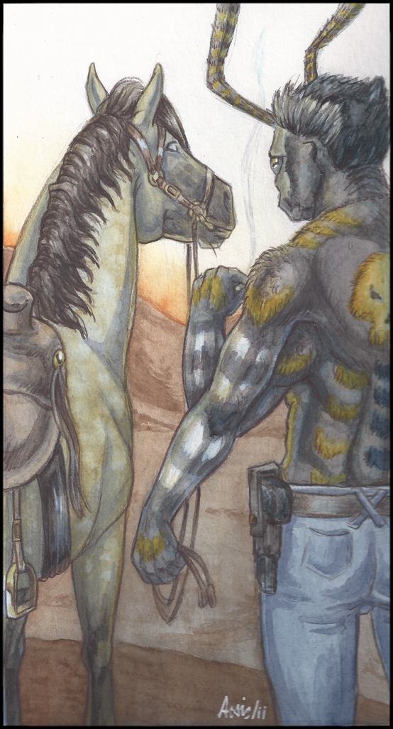
This is what I REALLY did at  's Watercolor Workshop. I am rather pleased with it although I think Jenny wasn't. She came along every now and then (okay, let's get real: I was crying like a hysteric baby every know and then - as in every ten minutes - and she came over to aid me) and gave me some advice on it and the things I wanted to achieve - a night scene, dark colors, a fuzzy moth with dark coat and bright markings - have proven themselves to be VERY tricky in watercolor. At least for a beginner like me.
I ended up adding a dozen layers of color on Konstantin's body which made him look fuzzy, which is okay because - he is! But still it wasn't what I was supposed to learn, here.
I am still pleased with the outcome, color-wise, although this is exactly 12 hours of work. But in the end, I only used a polychromos to render the outlines, and nearly nothing more. Some fuzz fpr Kostjas shoulders but no shading with colored pencils at all, like I usually do out of despair.
For the lineart... well. I have to apologize. As Jenny's workshop was a COLORING workshop and not a drawing workshop, and I forgot to BRING some finished linearts to color, I had to rush this one in an hour or so. (I then spent the double amount of time with contemplating, panicking and despair before I dared to start actually painting...)
The result it, I left out Kostja's wings because they would have covered up too much of the nice composition. And... of yourse... the thought of placing the horse in_front_of_him was a nice idea, but as I only drew this cropped image as you see it here, I messed up the proportions of rider and horse COMPLETELY. I noticed but hadn't time to re-draw everything and so I decided, that this was a little derp horse standing on an apple box [link] as you see here, and this is also the reason Kostja looks so detached at it. >_>;
I also got the perspective of the saddle belt wrong and placed it way behind the place it should sit on the horse but only noticed when I had started painting. I removed the belt but there was no way to fix the positioning of the stirrups. So my apologies for that, but no worries, I already noticed. Same goes for the headpiece and the bridle... both looks rather odd, but I used no reference at all and I had five riding lessons so far. So it hasn't sink into my consciousness yet how those things really work. But, I do my very best. Promised.
If you have read up to here, congratulations. Sign up for a washing machine.
Media: watercolor and a wee bit of colored pencil
characters: Konstantin Nachtfalter, my archerontia atropos and his faithfull... derp horse on apple box.
's Watercolor Workshop. I am rather pleased with it although I think Jenny wasn't. She came along every now and then (okay, let's get real: I was crying like a hysteric baby every know and then - as in every ten minutes - and she came over to aid me) and gave me some advice on it and the things I wanted to achieve - a night scene, dark colors, a fuzzy moth with dark coat and bright markings - have proven themselves to be VERY tricky in watercolor. At least for a beginner like me.I ended up adding a dozen layers of color on Konstantin's body which made him look fuzzy, which is okay because - he is! But still it wasn't what I was supposed to learn, here.
I am still pleased with the outcome, color-wise, although this is exactly 12 hours of work. But in the end, I only used a polychromos to render the outlines, and nearly nothing more. Some fuzz fpr Kostjas shoulders but no shading with colored pencils at all, like I usually do out of despair.
For the lineart... well. I have to apologize. As Jenny's workshop was a COLORING workshop and not a drawing workshop, and I forgot to BRING some finished linearts to color, I had to rush this one in an hour or so. (I then spent the double amount of time with contemplating, panicking and despair before I dared to start actually painting...)
The result it, I left out Kostja's wings because they would have covered up too much of the nice composition. And... of yourse... the thought of placing the horse in_front_of_him was a nice idea, but as I only drew this cropped image as you see it here, I messed up the proportions of rider and horse COMPLETELY. I noticed but hadn't time to re-draw everything and so I decided, that this was a little derp horse standing on an apple box [link] as you see here, and this is also the reason Kostja looks so detached at it. >_>;
I also got the perspective of the saddle belt wrong and placed it way behind the place it should sit on the horse but only noticed when I had started painting. I removed the belt but there was no way to fix the positioning of the stirrups. So my apologies for that, but no worries, I already noticed. Same goes for the headpiece and the bridle... both looks rather odd, but I used no reference at all and I had five riding lessons so far. So it hasn't sink into my consciousness yet how those things really work. But, I do my very best. Promised.
If you have read up to here, congratulations. Sign up for a washing machine.
Media: watercolor and a wee bit of colored pencil
characters: Konstantin Nachtfalter, my archerontia atropos and his faithfull... derp horse on apple box.
Image size
554x1026px 492.19 KB
© 2011 - 2024 balorkin
Comments15
Join the community to add your comment. Already a deviant? Log In
Hast du an den Farben noch was gemacht, oder den Himmel heller? Oder hat der Scan nicht alles aufgepickt? Auf mich wirkt es so jedenfalls sehr homogen!
Du hattest selber gesagt, du wolltest nicht mit so vielen Layern arbeiten; daher rührte meine Zurückhaltung, als du nach einiger Zeit immer mehr Layer machtest (Smile)") Du hast natürlich Recht; darüber habe ich mir noch nie explizit Gedanken gemacht, aber grade bei diesem Workshop ist mir wieder aufgefallen, dass Anfänger tendienziell eher vorsichtig sind mit Farbe, weil wenige Schichten als Anfänger leichter zu verarbeiten sind. Daher auch das Problem einer Nachtszene. (Ich habe dunkle Szenen anfangs total vermieden - oder gnadenlos in den Sand gesetzt!)
Du hast natürlich Recht; darüber habe ich mir noch nie explizit Gedanken gemacht, aber grade bei diesem Workshop ist mir wieder aufgefallen, dass Anfänger tendienziell eher vorsichtig sind mit Farbe, weil wenige Schichten als Anfänger leichter zu verarbeiten sind. Daher auch das Problem einer Nachtszene. (Ich habe dunkle Szenen anfangs total vermieden - oder gnadenlos in den Sand gesetzt!)
Du hattest selber gesagt, du wolltest nicht mit so vielen Layern arbeiten; daher rührte meine Zurückhaltung, als du nach einiger Zeit immer mehr Layer machtest